Michela Palermo & Palermo Publishing: a short interview about her adventures with the world of printed matter
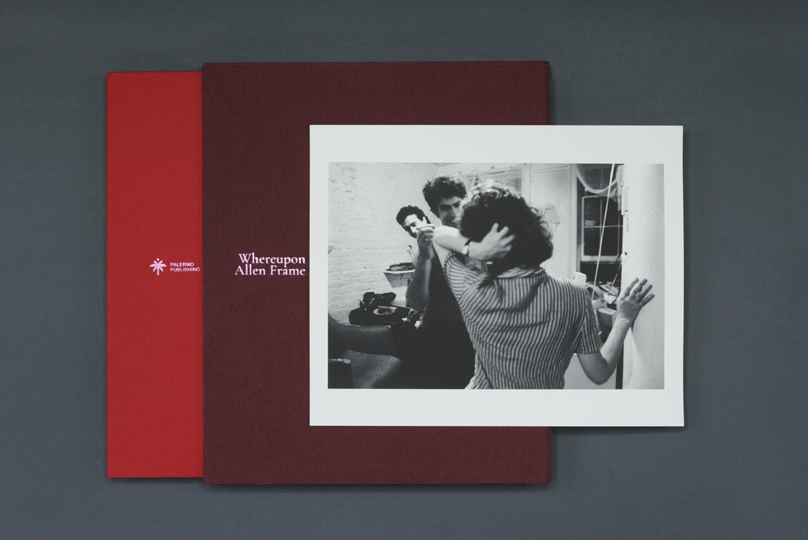
Michela Palermo is a photographer, designer, and publisher with whom we share a passion for art and publishing, a curiosity for the world of paper, and a beautiful friendship. The presentation of Allen Frame’s book Whereupon, along with the launch of the fanzine accompanying the installation at Leporello, on view through Sept. 12, was an opportunity to talk together about her work and the decision to found Palermo Publishing.
CC When did your love for what is called printed matter spark?
MP I was born in Italy in 1980 to a middle-class family. I shared a comic book subscription with my brother, which I eagerly awaited every week. I had an allowance that I spent on stickers and then magazines from the only newsstand in town. There were books, catalogs, encyclopedias at home, and monthly, weekly, and daily magazines, travel brochures, the Postal Market catalog, the Talismano della Felicità, my parents’ wedding album, photo albums of us growing up, with photos of birthdays, holidays and parties. I went to high school with the dictionary, collecting “100 pagine 1000 lire”( a famous Italian collection of paperbacks on literary classics from the ’90). And then I collected the flyers of events and concerts, the Interrail ticket, the notes from college, I used to write letters. I think a good part of my “sentimental education” was formed on paper.
You are a photographer, but your approach to books has a background in graphic design….
More than graphic design, I am passionate about design as a whole: editorial design, layout, materials, printing techniques, and all the elements that allow us to talk about the book as an object today. Before taking up photography, I studied Political Science, and my first course in the History of Contemporary Political Thought began with a reading of Michel Foucault’s The Order of Things. The book begins with a meticulous description of Velasquez’s “Las Meninas” and the play of representation that the painting affirms. I am interested in what is apparently invisible, and the design of a book is a good design when it vanishes into the work it protects and enhances.
The invisible usually helps us get in touch with other senses as well. When I think of books the first ones that come to mind are touch and hearing, but also the most mysterious of all, the sixth sense. How do these or other senses come into play in your design process?
For me, books are devices that can reproduce experiences, sensations, and geographies. I have to recognize myself in the research, in the story, in the writing, to become an interpreter, and I think I do it with a kind of instinct, a kind of enchantment or falling in love, whatever. Then I learned to experiment. Usually when I think of a book I imagine an idea and its opposite and I immediately seek a comparison with paper. Tentatively, I print maquettes. I look for the weight, the size, the proportion on the page. And while I’m building, assembling, somewhere in my head the opposite is happening, I’m breaking down, segmenting, eliminating. I have to say that my experience as a photographer in the years of social media has happily made me “iconoclastic”. This “irreverence” toward images helps to bring out other aspects of storytelling and a more choral discourse that the book, as an object, embodies very well. A book is a collection of things. It is plural.
When I think about my personal way of approaching the embryonic stage of planning a new book, I recognize a set of “habits”-let’s call them that-rather than an actual methodology, perhaps even a set of rituals. And you, how do you initiate this process?
I don’t initiate it. In the sense that I make so many attempts beforehand that by the time I decide to make a project, some things are already defined. I don’t know if I’ve explained myself, but for me the work comes after a series of conversations, researches, comparisons that then put me on a kind of track that I follow.
What made you start a publishing house?
I didn’t start a publishing house out of the blue. For more than 10 years I have been involved with editorial offices, workshops, bookstores, independent spaces, fairs, festivals, printers. I have seen my photographic work published in newspapers, magazines and catalogs, self-published my own work and that of others, designed editorial projects on commission, collaborated with artists and curators, met and observed other publishers or publishing experiences. In 2021, after Covid (which certainly slowed down my professional exchange and left me with a kind of creative vacuum), and especially after months in which, I think, everyone’s existence was swallowed up by this constant mediation of the digital, I began to think more concretely about the experience and even the risk of a publishing house, of not only dealing with my own research, but of putting it into dialogue with the work of others in order to make books, multiples, and to be able to distribute them. I began to assess the possibilities, the financial and creative commitment, and to imagine, because I believe that being a publisher requires a great deal of imagination.
design Michela Palermo, selfpublished
An imagination that sometimes involves confronting a possible editorial line. What is yours, if any? And in general, how do you see Palermo Publishing in, say, ten years?
I am interested in the visual arts and would like to publish poetry and critical texts.
I would like to be able to grow organically, keeping small editions with special attention to the quality in production and in the distribution network, working through “proximity”. In ten years, I would like having this conversation with you again, because I think publishing is the construction of endless conversations rather than a single opportunity and I would like to grow with the work of the professionals and artists who will choose me.
Why this book by Allen Frame?
When I began to think about the possibility of publishing, I looked for languages in which I recognized myself, artistic sensibilities close to me. I have known Allen Frame since 2008, when I was his student in the Creative Practices program at the International Center of Photography.
We have stayed in touch since then. Allen curated my photographic work and we collaborated on a series of his zines. By 2021, a monograph of his, Fever, had been published by Matte Editions, an independent American press, with only color photographs from 1981, and of his earlier work there is only one other publication, Detour, published by KEHERER in 2001.
I was living back in New York that fall, and Allen’s gallery was doing a sort of follow-up show for FEVER with a series of unpublished black and white photographs. I went with Allen to see the show; there were 17 photos on display. His black and white work has always been an inspiration to me. I asked him if he would like to do a book together, if we could go through his archive and expand the work, and then I would take care of the rest: the design, the production, and the distribution. Allen said yes. We worked together all through the fall. Some of the photos had never been printed, and then for each photo there was a story, his and his friends’, those years that must have been wonderful and terrible. Allen’s photography and New York are two very familiar places -if I may say so- and I didn’t feel shy to find them space in the white of pages.
What is Whereupon about?
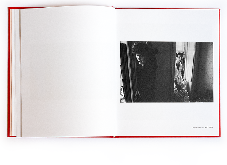
It is his personal archive from 1977 to 1992. His crushes, his friends, his roommates, his life in the West Village and the East Village in the 1980s. I think it’s a love letter. To New York, where everyone came from, to the dreams that the city held, to the generation that Allen belonged to, many of whom died prematurely of AIDS. And I think that tension remains latent in his images as they become darker and more subdued over the years.
There are so many lives intertwined in this work, and yet, as I flip through it, I don’t feel like I need to know anything about any of them, as if the relationships expressed through the bodies and how they relate to space would be enough. There is also this dimension of the distance of time that emerges and has great power in leafing through this book.
There was a dimension, I would say almost utopian, in what Allen’s generation was experiencing. And certainly one of rupture with a set of cultural and social conventions that ordered existences. I think that vision is probably the most valuable legacy of those years.
Can you tell us about the color inserts and layout strategies?
In the 1980s, Allen worked with the theater, first as an actor and then as a director and critic.
We often talked about how in both photography and theater there is a search for gesture, a study of the figure and the space around it. He had told me about these slides he made during the two performances he directed in New York and Berlin of an adaptation of David Wojnarowicz’s beautiful text Sound in Distance. The idea of having stage photographs seemed to me an interesting counterpoint to the narrative of the book, which is made up of shots of everyday life. Color would have restored a temperature to all the images. Of the color sessions, a third was needed. That’s how this beach sequence came about. Beautiful in its simplicity. There are Frank, Cady and Noland – all people very dear to Allen – walking on the beach at Coney Island. They move with the photographer, they leave the frame, they never leave each other. And to deal with the eighths in the print, I mirrored and broke up the images, creating repetitions, like glitches, because at first glance that repetition might not be so obvious. We liked the idea of the image repeating itself, like déjà vu.
How did you decide on the technical features of the book?
It’s a “family album”, it holds memories and an important collective history. There is this image of whispers at the beginning, of things said in the ear or on the phone, which made me think constantly of velvet, of theater curtains or movie theater seats, a liminal space between reality and fiction. The paper is uncoated, and instead the color images were printed glossy to create a gap in the turning of the pages. Allen’s text, “In the Wings” (an English expression for what happens in the wings of a theater), is written in the first person. We wanted it at the end: it finally restores a “solo” voice to a work conceived from the beginning in the fourth person: in editing the photographs, Allen could always be one of the subjects, so close is his point of view. Even in the final photographs by Jane Warrick, which we used to accompany Allen’s text, you see Allen as a subject with Frank and Butch as they talk. We liked that; it still felt like another narrative layer in the construction of the book.
Can you tell us more about this “fourth person” discourse?
Allen is the author of the photographs, but he moves through a group of friends/artists whose lives have been intertwined for a long time. It is this constant reference to a community that I think has made his human and artistic experience incredibly valuable. Perhaps one of the most beautiful portraits in the book is that of Darrell (Ellis). Darrell had asked Allen to photograph him because he wanted to use the material in his painting and collage research. Darrell Ellis died prematurely of AIDS, and Allen has been working for years preserving his archive, which has finally come to light and received great recognition, including a retrospective at the Bronx Museum in New York last summer and then at other major North American institutions.
You have printed with L’Artiere in Bologna, can you tell us more about this experience?
I am very interested in printing in Italy for several reasons. L’Artiere has an important history, Gianmarco Gamberini worked with a lot of knowledge and I learned a little. The printing process is very performative: there are technical limits and margins of error, and in this balance you can achieve results. And you have to be able to trust.
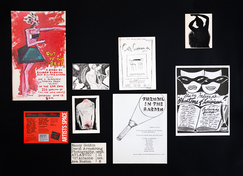
For the book launch here at Leporello’s, we decided to display a series of reproductions of ephemera that Allen has collected over the years. Objects that also fascinate you. Why is that?
Probably because of that “familiar lexicon” I mentioned in the first question. I belong to that era by a twist of the tail. Allen’s personal collection of ephemera consists of postcards, personal cards, invitations with addresses, exhibition and performance flyers. Looked at closely, they are a series of documents of events that happened, of encounters sought and missed. It is another level of reading that emerges and resonates within the pages of the book.
And you also made a zine. How, why?
For the presentations, we thought of a series of events that could engage the audience with the plural aspect of Allen’s work. And in the fanzine we printed Frank Franca’s footage of the performance that took place in New York, reproductions of the ephemera that we had in mind to show at Leporello, a text selected from David Wojnarowicz’s monologues that would be part of the evening’s reading at Supernova, two drawings by David Wojnarowicz David Wojnarowicz by James Romberger, and the poster from the final performance in Brooklyn in ’84. We wanted to celebrate that experience and have a record of it, and it came out as a zine, brutally printed at the copy shop I trust, in one color ink, on chemical paper. I think from a publishing point of view it’s a way to engage with the audience, to continue to build meanings around an experience. Maybe that is an aspect I would like to keep in the Palermo Publishing line.
Zines have always been a passion of yours, why?
Fanzines have the characteristic of being simple to produce, created with the magic of a photocopier, with production costs so low that they can be swapped or donated. For me, they were the first getaway from an editorial industry in which I really couldn’t fit. I like blurry photos and, fortunately, they printed very well in photocopy. I’ve secured assignments and impressed photo editors this way, though (un)fortunately not all of them.
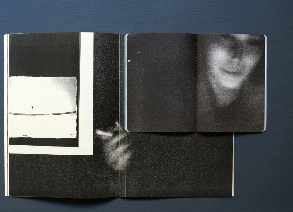
This is more or less how I came to know your work. One thing that has always fascinated me is that you keep repeating a series of images in different publications, bringing them to life in different ways, returning to one or more inner places over and over again, feeling the need to preserve them, and finally collecting them.
I believe that for some time now we have been living in a cacophonous era for photography. I have felt myself going through this noise completely. Over the years, I have felt the need to photograph less and work more with my archive, searching for a sort of “essence” in the images I’ve created. In this reflection, the creative process linked to printing in the darkroom has definitely helped me: in the darkroom, you reprint the same image 1000 times and in some way, the image changes each time. I started working with proofs, image fragments, and scraps. In this exercise, the weights of the image change. I believe that this practice has helped me to ground my vision, which I enjoy freely interpreting.
Going back to something you mentioned earlier, Allen’s book is not the first publishing project you have worked on together. There were actually zines with him before that ….
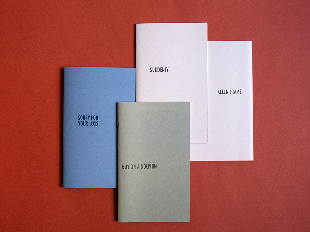
Allen writes poetry and we did three zines with some of his poems and images. They were very small editions, 1 out of 100. One of the three was with found images, and then Allen developed a publishing project with Meteoro Editions, a publishing house dedicated to vernacular photography.
Whereupon is a difficult word to translate into Italian, can you tell me more about its meaning and why you chose it for the title of the book?
It can be translated as “and therefore”. It is not a word used in spoken language. It has more to do with storytelling, like the expression “Once upon a time”. It was the title of the gallery exhibition, and we had the feeling that it could work very well for the book — and for the beginning of Palermo Publishing’s catalog 😉
The fanzine expands on the title by adding the word “turmoil,” which is also a very strong word.
“Turmoil” was the name of Allen’s theater company, and because the zine and the program around it wanted to explore this performative part of Allen’s work, this new title came about.
A discreet attention to gestures, ways of occupying space, and relationships between people seems to me to be at the heart of Allen Frame’s compositions-how do his photographs relate to his work as a theater director on the one hand, and to the dynamics of bookmaking on the other?
I believe, somewhat exhaustively, that Allen’s work is particularly tied to the process of “care”: the ability to create a safe space in which subjects can move and initiate new dynamics, simply because they are confronted and mutually accept their roles. In this, Allen has been a master for me, to whom I am grateful. As I am to you and for the time of this interview.
